Oct 11, 2023

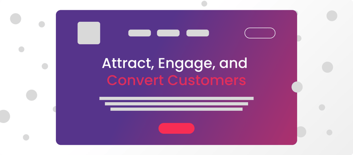
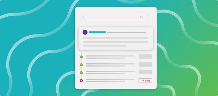
Creating a successful landing page can be tricky. How do you know you’ve done a good job? Does it convey what you want it to? Will the message resonate with the audience? Above all, does it convert into leads and purchases? We put together these five best practices to help you perform a self-audit on your website and see where there’s room for improvement. Perfecting your landing pages doesn’t need to be rocket science.
1) Define Landing Page Goals
Whether your goal is to gain purchases or new leads, the goal of your landing page should be focused. There should only be one call to action, and it should be clear. Having too many objectives can result in an abundance of content, too many CTA’s, and ultimately viewer confusion. If you want the viewer to sign up for a newsletter to boost brand awareness and gain leads, have a clear CTA button that says “sign up for the newsletter”. Maybe you want the user to have a conversation with your sales team; include a “book a meeting” button. No idea what your goal should be? Here are a few common ones:
- Increase Brand Awareness
- Generate High-Quality Leads
- Acquire New Customers
2) The Heading: Does Your Landing Page Pass the Grunt Test?
It is like it sounds - every landing page needs to pass the grunt test. This process was formulated by Storybrand to quickly test a landing page for relevance and clarity. Founder of Storybrand, Donald Miller says you should be able to show a caveman your landing page for 5 seconds, and they should be able to grunt back what your business does.
Remember that the first thing someone sees is your headline. It should convey exactly what your business does so you don’t confuse your audience. You can incorporate some fun verbiage and phrases only after you have told the consumer what it is they’re looking at. Most people will be skimming your site, which means that you shouldn’t be hiding what it is your business does in the smaller text. It should be the first thing they see. Big, bold, and clear is the goal.
3) Structure: Does The Layout Accomplish the Goal
You’ve evaluated your landing page’s end goal and have a headline that draws the right audience in. Now, it’s to craft a structure that acts like the fence in a horse corral. The structure of your landing page should lead the reader down a planned path with the dangling carrot waiting at the end. Here are a few key components to focus on.
- Clear Value Proposition: There are 3 main things to keep in mind when you are crafting your value proposition: who your ideal customer/lead is, the specific and concrete benefits of your product/service, and what makes those products/services unique from any other brand.
- Visual Focus: This represents the first background visual your potential customers/leads will see on the landing page. You never want to waste an opportunity like this on a stock photo (cue the horror music)! This is one of the most important if not the most important element of your page!

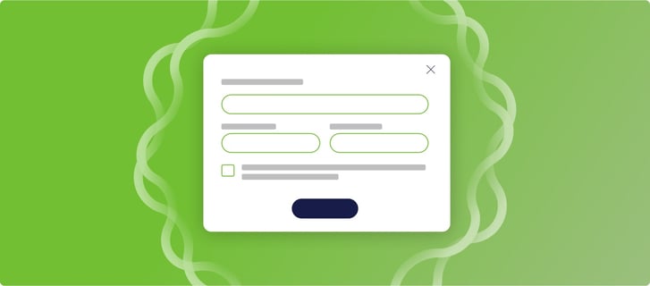
- Short Forms: What is the most important information you need from the visitors on the page? Each form should be short with only the most important information needed to either follow up or encourage a purchase.
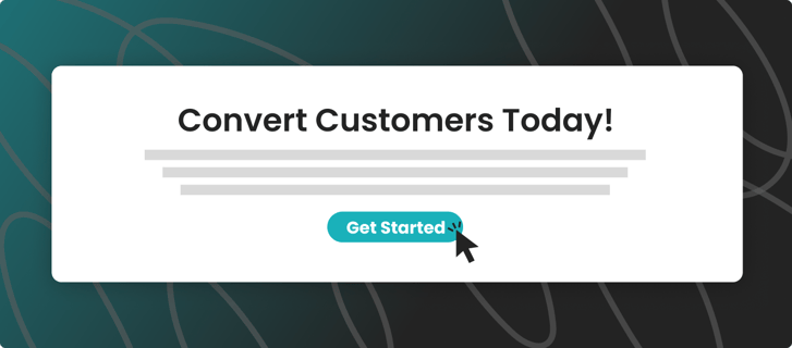
- Calls To Action: We’ll focus on this more in a bit, but every landing page should have 2-6 calls to action, depending on how long the page is. If you ever feel like you’re overdoing CTAs just ask yourself “am I ready exactly when the buyer is ready?” The buyer could be ready to convert on any part of the page. For more information on crafting calls to action, visit our blog on it here.
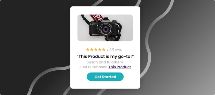
- Social proof: The best way to convince someone to convert is to show how many others did the same! Written/video testimonials, security/trust badges, other brands partnered with, etc… are all great forms of social proof!
- Show, Don’t Tell: Don’t leave space for assumptions about what’s next. For example, if you are a seafood delivery service, show each step it takes to get the seafood from your warehouse to their door. Make it simple and include visuals.

- No Text Blocks: Scan every piece of copy for text blocks before publishing. What may not look like a lot of text to you could still be unscannable to the customer. Bullet points and single sentences are ideal because loads of information rarely make someone click that CTA.

- SEO Optimization: To get a good ranking on Google, you will need a fast-loading page by optimizing visual content and ensuring the correct keywords are being used in the heading of the page and throughout. For a more in-depth look into SEO optimizing your webpage, check out our blog here.
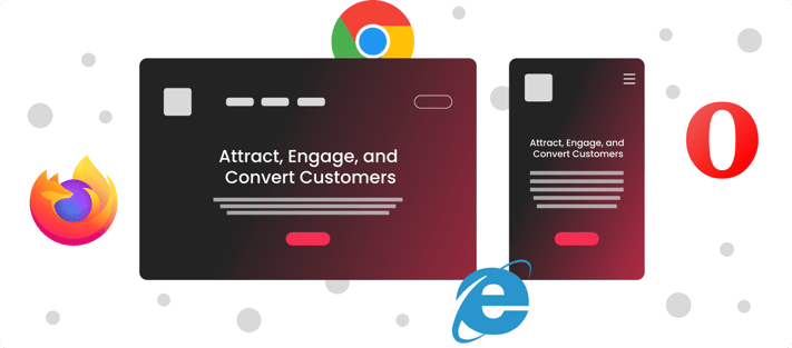
- Mobile-First & All Devices Review: Make sure the mobile version of your landing page is just as clear as the desktop version and check multiple browsers (safari, chrome, internet explorer, etc.) for any formatting issues. A common problem we see is inconsistent padding–the space between content being either too little or too much. You never want too much space between your content and call to action!
4) Calls to Action: The Ultimate Revenue Driving Machine
Crafting compelling calls to action (CTAs) is a critical aspect of designing an effective landing page. CTAs serve as the bridge between your content and the desired user action, be it signing up for a newsletter, making a purchase, or requesting more information. To create CTAs that truly resonate with your audience, it's essential to strike a balance between both their frequency and clarity.
First and foremost, avoid the temptation to litter your landing page with too many CTAs. Overwhelming users with multiple CTAs can lead to confusion and decision fatigue. Instead, focus on strategically placing CTAs at key junctures. A typical approach is to include a CTA button or form prominently in the hero section of the landing page. This is the first thing visitors see, so it should be clear, concise, and enticing.
The frequency and placement of additional CTAs should be determined by the size and complexity of your landing page. For shorter landing pages, one more CTA midway down the page can be effective in reiterating the main message and providing a second opportunity for conversion, and having a final CTA at the bottom of the page serves as a reminder and offers users one last chance to take action before leaving the page.
When crafting the copy for your CTAs, remember that consistency is key. Avoid using different button text for each CTA, as this can also create confusion and dilute the primary message. Instead, maintain a consistent message and value proposition throughout the CTAs, making it clear what users will gain by clicking. Use action-oriented, persuasive language that encourages users to take the desired action, such as "Get Started," "Learn More," or "Download Now."
5) Intuitive Design
While the overall structure and CTAs play a big part in your website's overall design, that's not all that needs to get attention when running a self-audit on your website. The general user experience also needs to be considered. The two biggest offenders to look for are your load times and the pop-ups used on your site.
If your website takes too long to load, you’ll see a high bounce rate from consumers leaving the website before it fully loads. Your web developer should be able to run tests to see the website speed and help make optimizations to improve it. Some of the elements that take the longest to load include large images, videos, special effects, and pages that are long with lots of content.
If you’re currently searching for some excellent tools that can audit your website, our team recommends downloading a few free trials before commiting to a permanent solution. Some great options to consider are Moz, Ahrefs and SEMrush.
As an additional tip, It’s important to note that load times aren’t the only factor that can increase your bounce rate. When you’re performing your site audit, pay attention to the timing of any pop-ups you have and what pages they trigger on. Make sure you aren’t bombarding consumers with pop-ups. If you’re going to have more than one pop-up on your website, make sure they don’t trigger on the same pages. The last thing you want is someone coming to your site and having to navigate through a maze of pop-ups that keep them from the content they’re looking for.
This also means that if you are going to use pop-ups, they should be relevant to the content on that page. A general call to action or offer can be used site-wide, but as your pages get more specific, try customizing that pop-up for that particular page.
In conclusion, perfecting your landing pages requires a thoughtful approach that addresses each aspect of your page's design and functionality. By following these best practices and conducting a comprehensive self-audit, you can create landing pages that effectively convey your message, engage your audience and most importantly drive conversions. At Fable Heart Media, crafting a successful landing page is not rocket science; it’s rather a process of continuous improvement and refinement. Contact our team when you’re ready to motivate customers with a landing page that fires on all cylinders. It’s only up from here.
We Help You Achieve Measurable Growth
We are Fable Heart Media, a digital marketing agency in Jacksonville, FL, that focuses on driving measurable growth and obtaining results for our clients. Whether you own a small company or lead a marketing team, our team can help you achieve your business goals. We love creating stunning websites and writing awesome blogs, but for us, nothing tops the feeling of watching our clients grow online due to our marketing partnership.