Jan 29, 2024

The holiday decorations have been taken down, and the new year is upon us. That means marketing trends are being implemented as we speak and are currently transforming the way we work this year and beyond. When it comes to website design specifically, trends are tricky to identify because of limitations between web and print and differences across platforms and websites. Enter the experts who’ve been at it for decades.
We called in our Senior Art Director, Sean Ferguson, to let us in on some secrets. Web design secrets, that is. Check out his biggest trend predictions for this coming year so you can start putting these into practice and stay miles ahead of your competition.
Parallax Scroll
What is Parallax Scrolling?
You’ve got questions; we’ve got answers! The word parallax /păr′ə-lăks″/ means a change in the perceived position of an object relative to more distant objects caused by a change in the observer’s line of sight relative to the objects. When it comes to web design, it is simply a technique in which an image is divided into a foreground and background that move separately as you scroll. To create an immersive 3-dimensional effect, the foreground moves faster than the background.
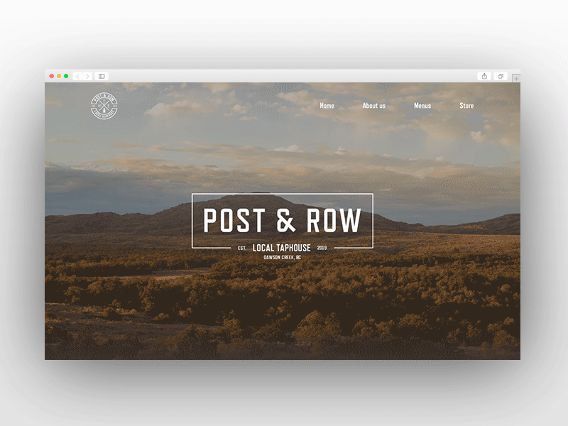
Post & Row Parallax Scrolling by Ruslan Vovchenko
Why Is It So Popular?
These days, you need to be able to capture visitors’ attention. Parallax scrolling achieves this quickly by making elements seem independent and animated. It kills two birds with one stone and gives the visitor the feeling of being immersed and in control of the animations.
Being directly linked with scrolling also makes it a great method to capture attention and inspire the user to scroll further to complete the parallax effect and potentially be guided and hooked into the next section. Oftentimes, parallax scrolling can enhance complex and exciting images or breathe life into mundane or long-form content, making it a really effective tool in the web designer toolkit.
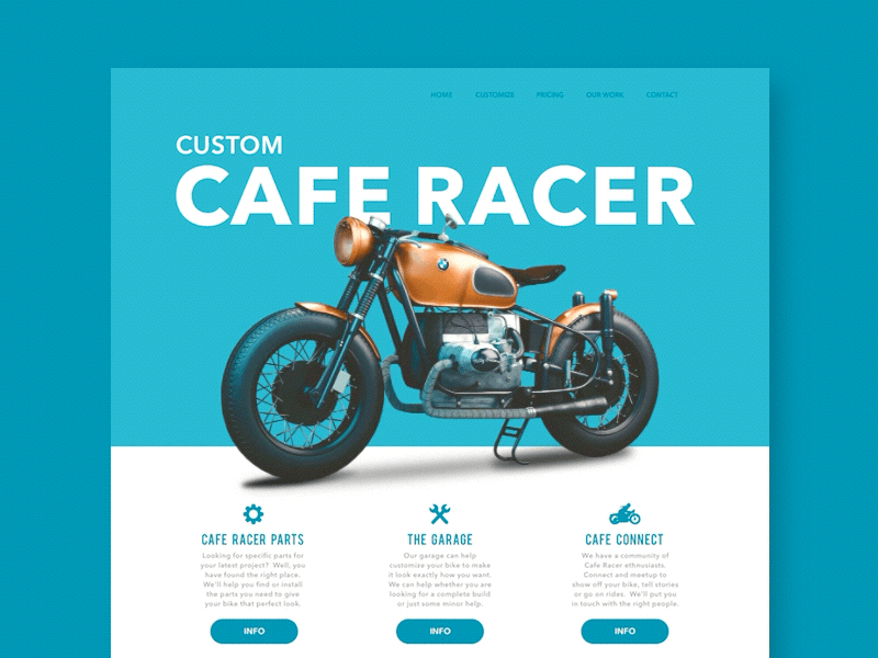
Parallax Scrolling Concept - Motorcycle Site by Gabe Becker
Examples of Parallax Scrolling
Neumorphism
What is Neumorphism?
Neumorphism is short for New Skeuomorphism. Skeuomorphism is a style popularized by Apple before the iPhone in which the design attempts to replicate the depicted object (a trashcan, wallet, glass of water, etc.) down to the last detail in order to create familiarity with objects on the computer for newcomers to their operating systems. 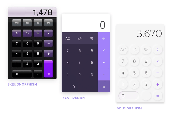
Calculator elements from Mojimomo and William Tapp.
As time went on and we became more accustomed to the intended meanings of certain icons, and as we became more dependent on mobile devices, it became clear that a change was needed. Many skeuomorphic designs struggled on mobile screens due to the tiny details being lost at smaller screen sizes, making the extra time and effort needed to create those details unnecessary. Because of this, many of the tech and brand giants we know today opted to scrap all extraneous details and leave an object in its simplest form, giving birth to the era of flat design.
While the minimalistic approach of flat design has reigned supreme for years, in 2019, Neumorphism was coined, taking the best of both worlds using minimalistic monochromatic colors and soft contrast paired with subtle shadows to create a clean design that still has some of the tactile dimensionality of skeuomorphism.
Note: There has been some debate on using this design style for accessibility. The low contrast causes some with sight impairment to struggle to differentiate between the elements.
Examples of Neumorphism
- Neumorphic Cards
- Neumorphism Day and Night
- Radio Player App Neumorphic Concept
- DJ Controller Mobile App
Kinetic Typography
What is Kinetic Type?
Kinetic Type is where animation meets typography. It can be as simple as type fading in or out, entering or exiting the screen. In contrast, it can also be much more complex by changing weight and shape or being manipulated using illustrations and motion. Really, anything goes. If it's moving typography, it’s kinetic typography.
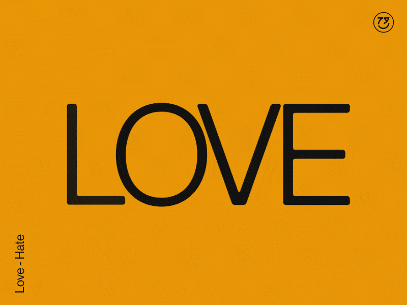
Love - Hate by Holke79
The popularity has grown as websites become more creative and need new ways to hold the interest of visitors. It can work as a great transition or even as a way to draw the eye to a particular button, feature, or logo. In many cases, it enhances the page and makes scrolling through a site more engaging and exciting.
Examples of Kinetic Type
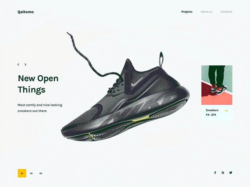
Large Hero Typography
Why Large Typography
There are many reasons to be big and bold right out of the gate. Using Large, striking typography can get to the point quickly, capture attention, and be used to create visual impact. In some cases, it can also be used to achieve a form of minimalism. Some designers are choosing to opt for large typography treatments instead of imagery in the hero section to more strongly convey the main intent of the page while increasing page load speed.
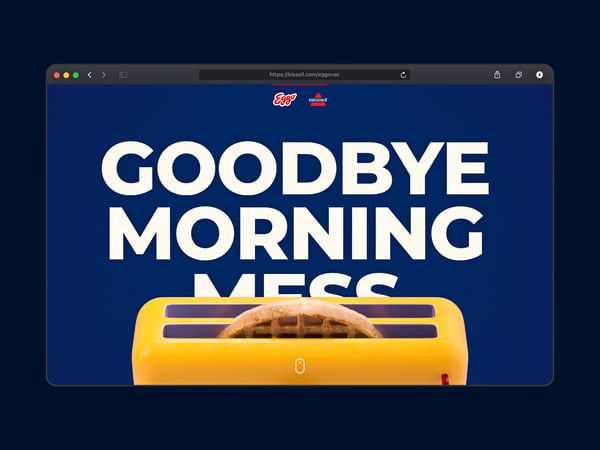
Egovac by DEPT®
Examples of Large Typography
Utilizing AI & Machine Learning
What About AI?
AI has introduced many tools available to web designers, and it will only get more popular and complex. Everything from research tools, code, and copy generation to image and video generation. AI can even help generate code for the website itself. AI has become similar to a web design assistant regarding tools.
While it is not in the preview of every brand, some user-based sites are poised to receive dividends on what AI can provide as machine learning is implemented in chatbots, content recommendations, user behavior analysis, user preferences, and much more. Having access to this data and, in some cases, being able to use AI to react to the data may prove to be a game changer in 2024 for businesses and advertisers.
Non-Traditional Scrolling
Non-traditional scrolling has always been a unique way to keep the viewer engaged. When sprinkled down the page, it can be a great transition point, and when used as a whole throughout the website, it can make your site stand out and inspire viewers to be more interactive.
Many popular sites stick to the vertical mold and the traditional grid, which breeds familiarity for viewers and creates a safe base grid to build onto in the future. But if your main concern is to make a statement and to stand out of the crowd, horizontal and diagonal scrolling, or content, and images detached from the grid, or even immersive scroll-dependent visuals may be the way to go.
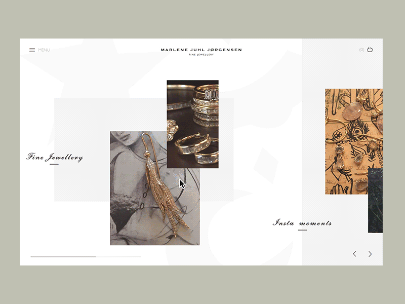 TJewellery brand - Horizontal scroll by Trine Dybkjær Rønsholdt for Signifly
Either way, it has been getting more popular as another way to express creativity and push the boundaries of what a website can do to achieve its goals, and we think that many designers will be toying with this concept over the next year.
Examples
Hand-Drawn and Organic Elements
What Makes Hand Drawn and Organic So Special?
The web used to be a rigid, text-based, underdeveloped place and a wild west of information. Websites were mostly straightforward and no-nonsense. They were also not generally aesthetically pleasing.
These days, as designers have taken a strong foothold on the internet to express the intentions and feelings of various brands, there has been a need for a softer, intentional design that feels more natural and akin to the lives lived by the brands’ audiences.
The benefit of hand-drawn elements and organic shapes is that they add a sense of humanity and, in some cases, childlike wonder into a world that is often too focused on technology and corporate professionalism to the point of coming off as cold, detached, dry, and repetitive.
Examples
Micro-Interactions
What Are Micro-Interactions
The devil is in the details. Microinteractions in web design are subtle, interactive elements to improve user experience and engagement. They include animations, hover effects, button responses, and loading indicators, offering feedback and visual cues. These features make interfaces more intuitive and enjoyable, providing immediate responses to user actions. Well-designed micro-interactions significantly enhance website usability and effectiveness as viewers engage with the various elements on the page.
Product Review Micro Interactions by UI8
Examples of Micro-Interactions
Dark Mode
What is Dark Mode?
Dark Mode is a design trend featuring a dark color scheme with light text and elements to reduce screen light emission for a comfortable viewing experience, especially in low-light settings. Its popularity stems from benefits like reduced eye strain, energy efficiency, improved readability, and aesthetic appeal.
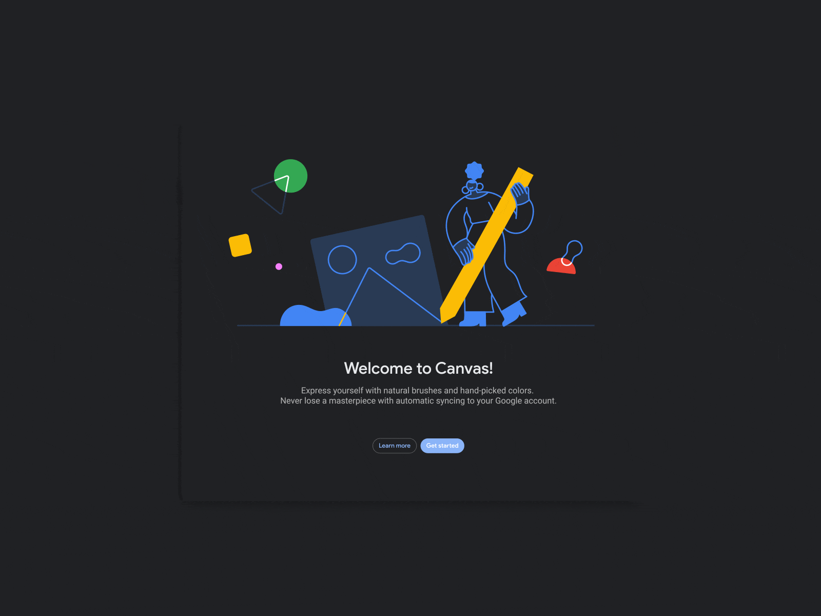
Dark Mode Switch by ILLO
As humans expose themselves to more screen time than ever before, its adoption has steadily increased with its popularity amongst major apps and operating systems. Platforms like Google, Instagram, Facebook, and Reddit have adopted this trend, and we believe it will become a staple and something to be considered in the design phase in 2024.
Dark Mode Examples
- The Moody Doula (click bottom left)
- Google (browser settings dependent)
- Instagram (account settings dependent)
- Facebook (account settings dependent)
- Reddit (account settings dependent)
Rotating Animations
The Appeal of Rotating Animations
While it may not be something every designer should consider in 2024, rotating animations have been something we’ve noticed more and more over the last few years and much more often leading into 2024. These animations are used as transitions in some cases, while in others, the entire scroll state of the site guides you through long-form content or even technical specs.
3D Rendered On-Scroll Animation by Leon Laskowsk
Some of our favorites have been product-specific sites that opt for a 3-dimensional animated guide of the product versus many static images. It feels more engaging and clarifying as if you have the product right in front of you.
These sites tend to be very heavy and complex, so it doesn’t always lend itself to a sustainable and repeatable practice, but as a unique and immersive technique, this one really stands out amongst the more standard gridded content and vertical scrolling websites out there.
Examples Rotating Animations
Other Notable Trends To Keep Note Of
- Retro Futurism
- Hyper Minimalism and Maximalism
- Voice-Activated Interface
- Glassmorphism
- Complex Gradients
Knowledge is truly power when it comes to staying on top of the consumer's wants and needs. Consider these trends as you build out your web design and development strategies for 2024. Our team of experts at Fable Heart Media put the ![]() in powerful design that speaks to the right customer at the right time. When you’re ready to implement your trends utilizing our creative team’s decades of expertise, reach out anytime at info@fableheartmedia.com.
in powerful design that speaks to the right customer at the right time. When you’re ready to implement your trends utilizing our creative team’s decades of expertise, reach out anytime at info@fableheartmedia.com.
Also, don’t miss our other blogs for inspiration on how to make 2024 your best year of business yet.
We Help You Achieve Measurable Growth
We are Fable Heart Media, a digital marketing agency in Jacksonville, FL, that focuses on driving measurable growth and obtaining results for our clients. Whether you own a small company or lead a marketing team, our team can help you achieve your business goals. We love creating stunning websites and writing awesome blogs, but for us, nothing tops the feeling of watching our clients grow online due to our marketing partnership.